
Back in June, I wrote about how the average length of touchdown passes was declining significantly. I wanted to revisit that post with a graph that really highlights the change in the type of touchdown passes thrown over time. The graph below shows, for each season from 1950 to 2017, the percentage of touchdown passes each year that were:
- At least 50+ yards, plotted in dark red;
- 30-49 yards, plotted in in red;
- 20-29 yards, plotted in gray;
- 10-19 yards, plotted in light blue;
- Inside of 9 yards, plotted in dark blue.
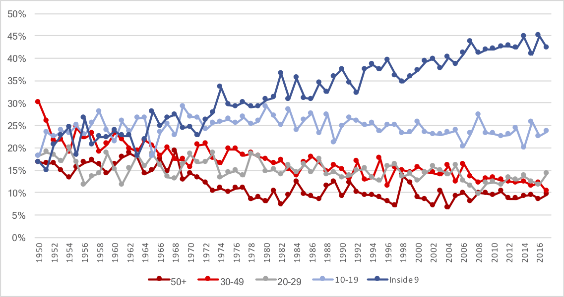
The overall trend is obvious: while in the ’60s, fewer than 25% of touchdown passes came from inside of 9 yards, in modern times, well over 40% of touchdown passes come from that range. On a raw basis, as recently as 1975, there were more touchdown passes from 30+ yards (85 from 30-49, 44 from 50+) than from 9 yards and in (128). Last season, there were 314 touchdown passes from the 9 yard line or closer, and 157 from 30+ (76 from 31-49, 71 from 50+).
What’s really notable is that while passing touchdowns are on the rise, that is entirely a function of short touchdowns. There are 32 teams and 16 games per season, providing for 512 team games in modern times. In the graph below, the dark red line shows the number of passing touchdowns in each season per 512 team games. The high-water mark was 2015, when there were 842 passing touchdowns, and therefore 842 passing touchdowns per 512 team games. But the dark blue line shows the number of passing touchdowns per 512 team games but excluding all touchdown passes inside of 9 yards. That number has been relatively constant across NFL history (well, at least since the merger), but if anything, the trend (both shot-term since 2015, and long-term) is negative for gross passing touchdowns once you eliminate the shortest throws.

Pretty interesting, eh?